WWDC 2025 -SwiftUI 7.0- iOS 26
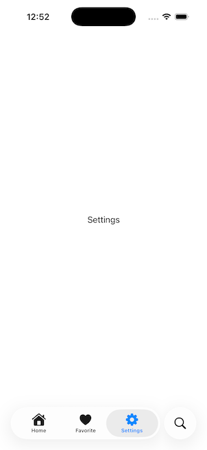
1. Liquid Glass Effects 리퀴드 글래스 효과
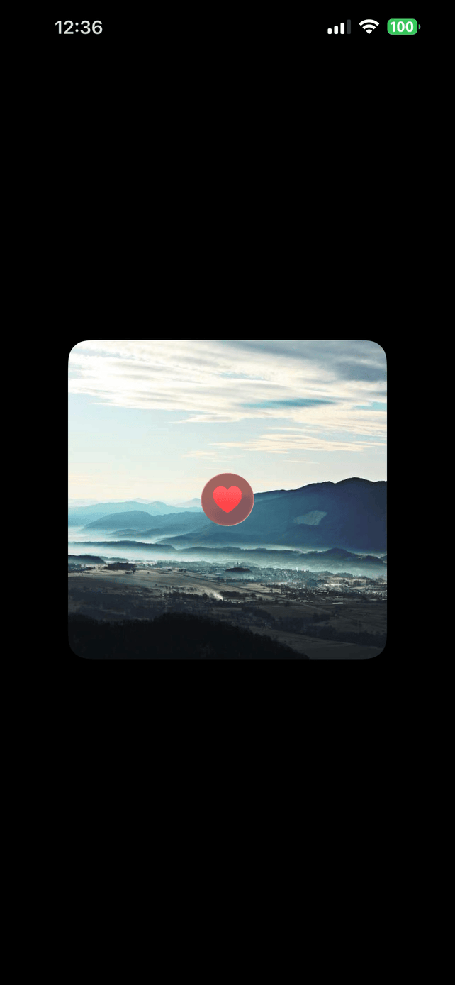
새로운 리퀴드 글래스 효과는 거의 모든 시스템 전반의 앱, 컨트롤 등에 사용됩니다. 우리 앱에 이를 적용하는 것은 큰 일이 아닙니다. 다행히도 SwiftUI는 기본 컨트롤뿐 아니라 사용자 정의 뷰에도 리퀴드 글래스 효과를 지원하여, 이러한 효과를 쉽게 추가할 수 있습니다. 그럼 이제 이 글래스 효과를 앱에 어떻게 추가할 수 있는지 살펴봅시다.
1
2
3
4
5
6
7
8
9
10
11
12
13
14
15
16
17
18
19
20
21
22
struct ContentView: View {
    @State private var isExpanded: Bool = false
    var body: some View {
        ZStack {
            /// Background Image
            Image("Pic")
                .resizable()
                .aspectRatio(contentMode: .fill)
                .frame(width: 300, height: 300)
                .clipShape(.rect(cornerRadius: 20))

            /// Custom View with Liquid Glass Effect
            Image(systemName: "suit.heart.fill")
                .font(.title)
                .foregroundStyle(.red.gradient)
                .frame(width: 50, height: 50)
            /// Can make any custom glass effect to be interactable!
            /// Can adjust it's background tint as well
                .glassEffect(.regular.tint(.red.opacity(0.35)).interactive(), in: .circle)
        }
    }
}
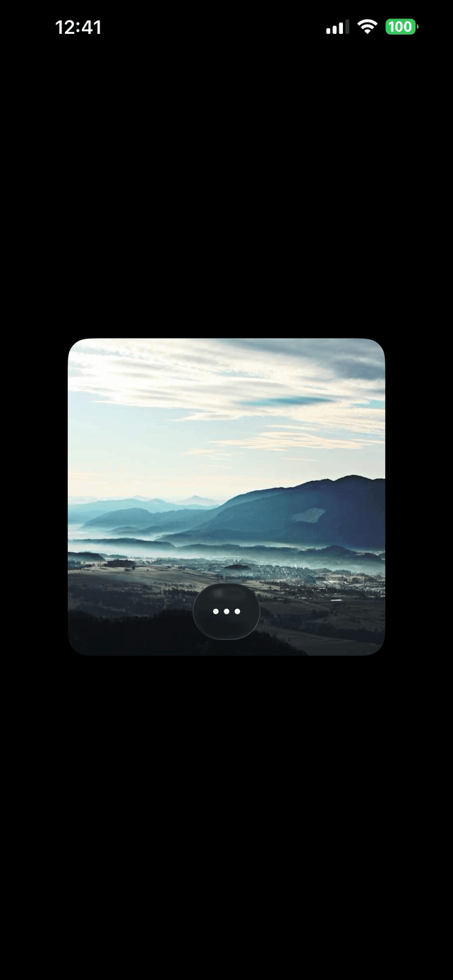
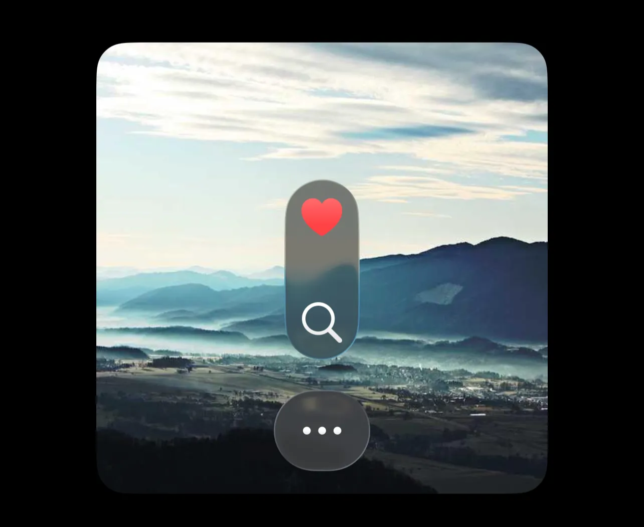
2. GlassEffectContainer (Morphing 및 그룹화에 사용됨)
SwiftUI는 GlassEffectContainer라는 네이티브 컨테이너를 제공합니다. 이 컨테이너를 사용하면 손쉽게 모핑 효과를 만들고, 여러 뷰를 그룹화하여 단일 글래스 효과를 구현할 수 있습니다.
참고: 모핑 효과나 다른 효과들은 간격(Spacing)이 서로 일치하지 않으면 동작하지 않는다는 것을 알게 되었습니다. 예를 들어, VStack에 간격을 20으로 설정했다면, 동일한 간격을 Container에도 적용해야 합니다.
3. glassEffectTransition()
예를 들어, 앱에서 특정 설정이 활성화되었을 때 애니메이션이 필요하지 않은 경우
(예: “Reduce Animations” 토글), 이 모디파이어를 사용하여 모핑 효과와 애니메이션을 제거할 수 있습니다!
1
2
3
4
5
6
7
8
9
10
11
12
13
14
15
16
17
18
19
20
21
22
23
24
25
26
27
28
29
30
31
32
33
34
35
36
37
38
39
40
41
42
43
44
45
46
47
48
49
struct ContentView: View {
    @State private var isExpanded: Bool = false
    var body: some View {
        ZStack {
            /// Background Image
            Image("Pic")
                .resizable()
                .aspectRatio(contentMode: .fill)
                .frame(width: 300, height: 300)
                .clipShape(.rect(cornerRadius: 20))
                .overlay(alignment: .bottom) {
                    GlassEffectContainer(spacing: 20) {
                        VStack(spacing: 20) {
                            Spacer()

                            if isExpanded {
                                Group {
                                    Image(systemName: "suit.heart.fill")
                                        .font(.title)
                                        .foregroundStyle(.red.gradient)
                                        .frame(width: 50, height: 50)

                                    Image(systemName: "magnifyingglass")
                                        .font(.title)
                                        .foregroundStyle(.white.gradient)
                                        .frame(width: 50, height: 50)
                                }
                                .glassEffect(.regular, in: .circle)
                                //.glassEffectTransition(.identity) //이 모디파이어를 사용하여 모핑 효과와 애니메이션을 제거할 수 있습니다!
                            }

                            Button {
                                withAnimation(.smooth(duration: 1, extraBounce: 0)) {
                                    isExpanded.toggle()
                                }
                            } label: {
                                Image(systemName: "ellipsis")
                                    .font(.title)
                                    .foregroundStyle(.white.gradient)
                                    .frame(width: 40, height: 40)
                            }
                            .buttonStyle(.glass)
                        }
                    }
                    .padding(15)
                }
        }
    }
}
4. glassUnion()
예를 들어, 두 개의 뷰를 그룹화하여 별도의 HStack/VStack을 작성하지 않고 단일 글래스 효과를 만들고 싶다면, 이 모디파이어를 사용할 수 있습니다. 이 모디파이어는 각 뷰가 개별적으로 효과를 가지는 대신, 단일 글래스 효과를 적용합니다!
1
2
3
4
5
6
7
8
9
10
11
12
13
14
15
16
17
18
19
20
21
22
23
24
25
26
27
28
29
30
31
32
33
34
35
36
37
38
39
40
41
42
43
44
45
46
47
48
struct ContentView: View {
    @State private var isExpanded: Bool = false
    @Namespace private var animation
    var body: some View {
        ZStack {
            /// Background Image
            Image("Pic")
                .resizable()
                .aspectRatio(contentMode: .fill)
                .frame(width: 300, height: 300)
                .clipShape(.rect(cornerRadius: 20))
                .overlay(alignment: .bottom) {
                    GlassEffectContainer(spacing: 20) {
                        VStack(spacing: 20) {
                            Spacer()

                            Group {
                                Image(systemName: "suit.heart.fill")
                                    .font(.title)
                                    .foregroundStyle(.red.gradient)
                                    .frame(width: 50, height: 50)

                                Image(systemName: "magnifyingglass")
                                    .font(.title)
                                    .foregroundStyle(.white.gradient)
                                    .frame(width: 50, height: 50)
                            }
                            .glassEffect(.regular, in: .capsule)
                            .glassEffectUnion(id: "Group-1", namespace: animation)

                            Button {
                                withAnimation(.smooth(duration: 1, extraBounce: 0)) {
                                    isExpanded.toggle()
                                }
                            } label: {
                                Image(systemName: "ellipsis")
                                    .font(.title)
                                    .foregroundStyle(.white.gradient)
                                    .frame(width: 40, height: 40)
                            }
                            .buttonStyle(.glass)
                        }
                    }
                    .padding(15)
                }
        }
    }
}
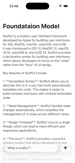
5. FoundationModels (SDK)
(온디바이스 인텔리전스)
Xcode 26에는 이제 FoundationModels SDK가 포함되어, 온디바이스 인텔리전스 모델을 활용할 수 있습니다. 이 모델들은 디바이스 내에서 동작하기 때문에, 디바이스가 오프라인 상태여도 기능을 수행할 수 있습니다. 이제 이 새로운 SDK의 핵심적인 활용 사례들을 살펴보겠습니다.
⭐️ iPhone 15 이상 또는 M1 칩이 달린 iPad / Mac 이후 기종 만 지원됨
+. streamResponse 코드 몇 줄만으로도 우리는 이 새로운 SDK를 이용해 AI 채팅을 만들 수 있습니다. 하지만 답변이 너무 오래 걸린다는 것을 눈치채셨나요?
네, 그 이유는 제가 한 번에 전체 결과를 요청하고 있기 때문입니다. 하지만 부분적인 반복 결과(Partial Iterative Results)를 받을 수 있는 방법이 있습니다. 이 방식은 요즘 AI 채팅에서 가장 흔히 사용되고 있죠.
1
2
3
4
5
6
7
8
9
10
11
12
13
14
15
16
17
18
19
20
21
22
23
24
25
26
27
28
29
30
31
32
33
34
35
36
37
38
39
40
41
42
43
44
45
46
47
48
49
50
51
52
53
54
55
56
57
import FoundationModels

struct ContentView: View {
    @State private var prompt: String = ""
    @State private var answer: String = ""
    @State private var disableControls: Bool = false
    var body: some View {
        NavigationStack {
            ScrollView(.vertical) {
                Text(answer)
                    .frame(maxWidth: .infinity, alignment: .leading)
                    .multilineTextAlignment(.leading)
                    .padding(15)
            }
            .safeAreaBar(edge: .bottom) {
                HStack(spacing: 10) {
                    TextField("Prompt", text: $prompt)
                        .padding(.horizontal, 15)
                        .padding(.vertical, 10)
                        .glassEffect(.regular, in: .capsule)

                    Button {
                        Task {
                            guard !prompt.isEmpty else { return }

                            do {
                                let session = LanguageModelSession()
                                disableControls = true

                                let response = session.streamResponse(to: prompt)


                                for try await chunk in response {
                                    self.answer = chunk.content
                                }

                                disableControls = false
                            }catch {
                                disableControls = false
                                print(error.localizedDescription)
                            }
                        }

                    } label: {
                        Image(systemName: "paperplane.fill")
                            .frame(width: 30, height: 30)
                    }
                    .buttonStyle(.glass)
                }
                .disabled(disableControls)
                .padding(25)

            }
            .navigationTitle("Foundataion Model")
        }
    }
}
6. FoundationModels (@Generable)
FoundationModels에는 @Generable 이라는 매크로가 포함되어 있으며, 이를 통해 LanguageModelSession이 지정된 모델을 위한 데이터를 생성할 수 있습니다.
이 예시에서는 Todo 라는 이름의 모델을 생성할 것입니다.
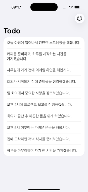
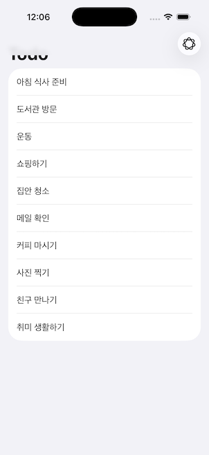
이 매크로를 사용하면, 언어 모델에게 무작위 할 일(todo) 목록을 생성하도록 요청할 수 있습니다.
비록 이것이 실질적인 사용 사례는 아닐 수 있지만, 다른 많은 시나리오에서 유용하게 활용될 수 있습니다!
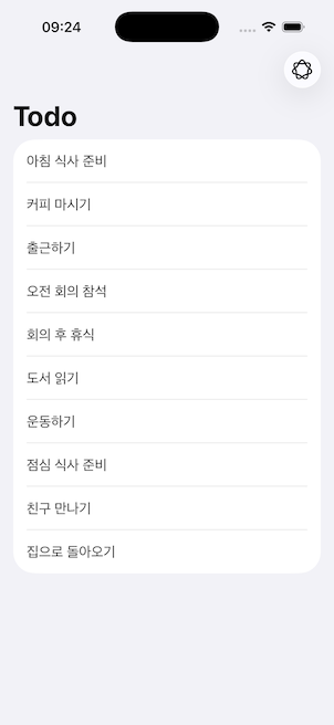
+. @Guide()
이것은 LanguageModel에 이러한 속성을 채우는 데 필요한 컨텍스트를 제공합니다. 또한, @Generable에도 이러한 설명을 제공할 수 있습니다!
@Guide() 적용을 하면 아래 사진 처럼 Contenxt 가 @Guide(description: “칫솔질”)에 따라 비슷한 형식으로 변경된다.
1
2
3
4
5
6
7
8
9
10
11
12
13
14
15
16
17
18
19
20
21
22
23
24
25
26
27
28
29
30
31
32
33
34
35
36
37
38
39
40
41
42
43
44
45
46
47
48
49
50
51
52
53
54
55
56
import SwiftUI
import FoundationModels

struct ContentView: View {
    @State private var todos: [Todo] = []
    @State private var isWriting: Bool = false
    var body: some View {
        NavigationStack {
            List {
                ForEach(todos) { todo in
                    Text(todo.task)
                }
            }
            .navigationTitle("Todo")
            .toolbar(content: {
                ToolbarItem(placement: .topBarTrailing) {
                    Button("", systemImage: "apple.intelligence") {
                        let propmt = "Create 10 todo list items in Korean"
                        Task {
                            do {
                                let session = LanguageModelSession()
                                let response = session.streamResponse(generating: [Todo].self) {
                                    propmt
                                }

                                isWriting = true
                                for try await chunkTodos in response {
                                    self.todos = chunkTodos.content.compactMap({
                                        if let id = $0.id, let task = $0.task {
                                            return .init(id: id, task: task)
                                        }

                                        return nil
                                    })
                                }

                                isWriting = false
                            }catch {
                                isWriting = false
                                print(error.localizedDescription)
                            }
                        }
                    }
                    .disabled(isWriting)
                }
            })
        }
    }
}

@Generable
struct Todo: Identifiable {
    var id: String
    @Guide(description: "칫솔질") //어떤 내용이 올지 샘플을 제공함
    var task: String
}
7. scrollEdgeEffectStyle()
기본적으로, List, Navigation, 그리고 다른 UI 컴포넌트들은 이제 안전 영역(safe areas)에 부드러운 블러 효과(Progressive Blurs라고도 불림)를 갖습니다. 그러나 SwiftUI는 이러한 효과를 제어할 수 있는 간단한 수정자(modifier)를 제공합니다.
1
2
3
4
5
6
7
8
9
10
11
12
13
14
15
16
17
18
19
20
21
22
23
24
25
26
27
28
29
30
31
32
33
34
35
36
37
38
39
40
41
42
43
44
45
46
47
48
49
50
import SwiftUI
import FoundationModels

struct ContentView: View {
    @State private var todos: [Todo] = []
    @State private var isWriting: Bool = false
    var body: some View {
        NavigationStack {
            List {
                ForEach(todos) { todo in
                    Text(todo.task)
                }
            }
            .navigationTitle("Todo")
            .toolbar(content: {
                ToolbarItem(placement: .topBarTrailing) {
                    Button("", systemImage: "apple.intelligence") {
                        let propmt = "Create 10 todo list items in Korean"
                        Task {
                            do {
                                let session = LanguageModelSession()
                                let response = session.streamResponse(generating: [Todo].self) {
                                    propmt
                                }

                                isWriting = true
                                for try await chunkTodos in response {
                                    self.todos = chunkTodos.content.compactMap({
                                        if let id = $0.id, let task = $0.task {
                                            return .init(id: id, task: task)
                                        }

                                        return nil
                                    })
                                }

                                isWriting = false
                            }catch {
                                isWriting = false
                                print(error.localizedDescription)
                            }
                        }
                    }
                    .disabled(isWriting)
                }
            })
            .scrollEdgeEffectStyle(.hard, for: .top)
        }
    }
}
8. backgroundExtensionEffect()
작은 이미지를 사용할 때 잠금 화면 상단에서 확장된 블러 효과가 나타나는 것을 모두 본 적이 있을 것입니다.
그런데 이제 이 기능이 SwiftUI에서 modifier(수정자) 로 제공됩니다!
이 수정자는 뷰를 사용 가능한 안전 영역(safe areas)까지 확장하며, 그 영역에 은은한 블러 효과를 적용합니다.


1
2
3
4
5
6
7
8
9
10
11
12
13
14
15
import SwiftUI

struct ContentView: View {
    var body: some View {
        GeometryReader {
            let size = $0.size
            Image(.pic2)
                .resizable()
                .aspectRatio(contentMode: .fill)
                .frame(width: size.width, height: size.height)
                .clipped()
                .backgroundExtensionEffect()
        }
    }
}
9. Rich TextEditor
마침내, TextEditor가 이제 AttributedString 을 Binding으로 지원합니다. 또한 기본 제공 TextEditor에는 몇 가지 유용한 리치 텍스트 편집 기능 옵션도 포함되어 있습니다!
1
2
3
4
5
6
7
8
9
10
import SwiftUI

struct ContentView: View {
    @State private var richText = AttributedString()
    var body: some View {
        TextEditor(text: $richText)
            .frame(height: 300)
            .padding(15)
    }
}
10. Native WebView
SwiftUI가 이제 Native WebView 를 지원합니다. 스크롤 위치 추적, 스크롤 위치 업데이트, 특정 제스처 비활성화 등 다양한 기본 내장 기능들이 포함되어 있습니다.
1
2
3
4
5
6
7
8
9
10
11
12
import SwiftUI
import WebKit

struct ContentView: View {
    var body: some View {
        WebView(url: url)
    }

    var url: URL {
        URL(string: "https://developer.apple.com")!
    }
}
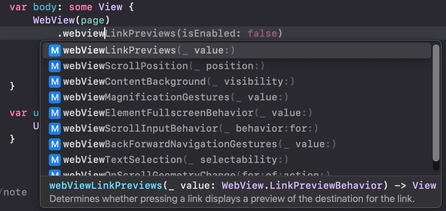
11. WebPage()
WebPage를 사용하여 페이지를 불러올 수도 있습니다. 이렇게 하면 웹 페이지를 보다 프로그래밍적으로 제어할 수 있습니다!
1
2
3
4
5
6
7
8
9
10
11
12
13
14
15
16
17
import SwiftUI
import WebKit

struct ContentView: View {
    @State private var page = WebPage()
    var body: some View {
        WebView(page)
            .webViewMagnificationGestures(.disabled)
            .onAppear {
                page.load(URLRequest(url: url))
            }
    }

    var url: URL {
        URL(string: "https://developer.apple.com")!
    }
}
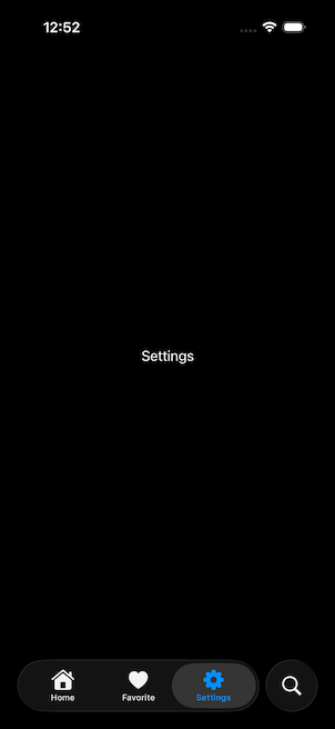
12. TabView Customizations
기본적으로, SwiftUI는 새로운 iOS 26 글로시 탭 바(glossy tab bar) 에 자동으로 적용됩니다. (단, 앱이 이전에 네이티브 탭 바를 사용했을 경우이며, 커스텀 탭 바를 사용한 경우는 제외됩니다.)
iOS 26에서는 검색(Search) 역할의 탭 아이템이 탭 바에서 제외되어, 탭 바와는 별도로 표시됩니다!
1
2
3
4
5
6
7
8
9
10
11
12
13
14
15
16
17
18
19
20
21
22
23
import SwiftUI

struct ContentView: View {
    var body: some View {
        TabView {
            Tab.init("Home", systemImage: "house.fill") {
                Text("Home")
            }

            Tab.init("Favorite", systemImage: "suit.heart.fill") {
                Text("Favorite")
            }

            Tab.init("Settings", systemImage: "gearshape.fill") {
                Text("Settings")
            }

            Tab.init("Search", systemImage: "magnifyingglass", role: .search) {
                Text("Search")
            }
        }
    }
}
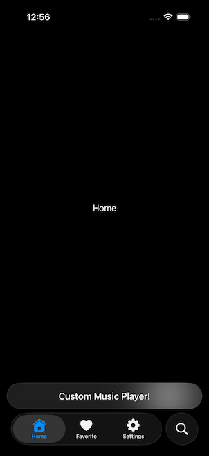
+. tabViewBottomAccessory()
iOS 26에서는 TabView 가 이제 탭 바 위에 액세서리 뷰를 추가하는 것을 지원합니다.
(Apple Music 앱과 동일한 방식입니다.)
1
2
3
4
5
6
7
8
9
10
11
12
import SwiftUI

struct ContentView: View {
    var body: some View {
        TabView {...}
        .tabViewBottomAccessory {
            Text("Custom Music Player!")
                .padding(.horizontal, 15)

        }
    }
}
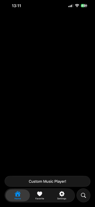
+. tabBarMinimizeBehaviour()
Apple Music 앱과 마찬가지로, 이제 탭 바는 스크롤을 내리거나(Scrolled Down) 올릴 때(Scrolled Up) 최소화(minimizing)를 지원합니다.
스크롤을 내리거나 올리면, 검색(Search) 역할의 탭 아이템은 오른쪽으로 이동하고, 탭 바는 최소화되어 왼쪽으로 밀립니다.
또한, 액세서리 뷰는 중앙으로 이동하게 됩니다.
1
2
3
4
5
6
7
8
9
10
11
12
13
14
15
16
17
18
19
20
21
22
23
24
25
26
27
28
29
30
31
32
33
34
35
import SwiftUI

struct ContentView: View {
    var body: some View {
        TabView {
            Tab.init("Home", systemImage: "house.fill") {
                ScrollView(.vertical) {
                    Text("Home")
                        .containerRelativeFrame([.horizontal])
                        .containerRelativeFrame(.vertical) { value, _ in
                            value * 3
                        }
                }
            }

            Tab.init("Favorite", systemImage: "suit.heart.fill") {
                Text("Favorite")
            }

            Tab.init("Settings", systemImage: "gearshape.fill") {
                Text("Settings")
            }

            Tab.init("Search", systemImage: "magnifyingglass", role: .search) {
                Text("Search")
            }
        }
        .tabViewBottomAccessory {
            Text("Custom Music Player!")
                .padding(.horizontal, 15)

        }
        .tabBarMinimizeBehavior(.onScrollDown)
    }
}
📒 tabBarAccessoryPlacement 환경(environment)을 사용하여 탭 바 액세서리 뷰를 상황에 맞게 업데이트할 수 있습니다!
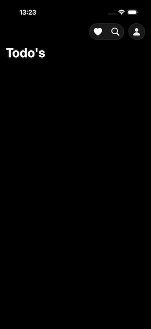
13. ToolBarSpacer
기본적으로, 모든 ToolBar 아이템은 iOS 26에서 함께 그룹화됩니다. 그러나 경우에 따라 버튼을 그룹에서 분리해야 할 필요가 있을 수 있습니다. 이 새로운 modifier는 ToolBar 아이템을 분리하거나, 여러 개의 ToolBar 아이템 그룹을 만드는 데 특히 유용합니다.
1
2
3
4
5
6
7
8
9
10
11
12
13
14
15
16
17
18
19
20
21
22
23
24
25
26
27
28
29
30
31
import SwiftUI

struct ContentView: View {
    var body: some View {
        NavigationStack {
            List {

            }
            .navigationTitle("Todo's")
            .toolbar {
                ToolbarItem(placement: .topBarTrailing) {
                    HStack {
                        Button("", systemImage: "suit.heart.fill") {

                        }
                        Button("", systemImage: "magnifyingglass") {

                        }
                    }
                }
                ToolbarSpacer(.fixed, placement: .topBarTrailing)

                ToolbarItem(placement: .topBarTrailing) {
                    Button("", systemImage: "person.fill") {

                    }
                }
            }
        }
    }
}
14. @Animatable
보시는 것처럼, 이 원(circle) 모양을 애니메이션화하려면, 이전에는 Shape의 모든 속성을 animatable 프로토콜에 맞게 구현해야 했습니다.
그러나 이 간단한 매크로만 사용하면 전체 Shape가 애니메이션화될 수 있습니다.
그런데, 만약 특정 속성에는 애니메이션이 필요하지 않다면 어떻게 할까요?
그 경우에는 해당 속성에 @AnimatableIgnored 매크로를 사용할 수 있습니다!
1
2
3
4
5
6
7
8
9
10
11
12
13
14
15
16
17
18
19
20
21
22
23
24
25
26
27
28
29
30
31
32
33
34
35
36
37
38
39
import SwiftUI

struct ContentView: View {
    @State private var expand: Bool = false
    var body: some View {
        VStack {
            CircleShape(radius: expand ? 100 : 0)
                .contentShape(.rect)
                .onTapGesture {
                    withAnimation(.smooth) {
                        expand.toggle()
                    }
                }
        }
        .padding()
    }
}


struct CircleShape: Shape {
    var radius: CGFloat

    var animatableData: CGFloat {
        get { radius }
        set { radius = newValue }
    }

    func path(in rect: CGRect) -> Path {
        Path { path in
            path
                .addArc(
                    center: .init(x: rect.midX, y: rect.midY),
                    radius: radius,
                    startAngle: .zero,
                    endAngle: .init(degrees: 360),
                    clockwise: false)
        }
    }
}
+. @Animatable 사용방법 정정
View, ViewModifier 가능
Shape (이미 Animatable 프로토콜 채택됨) 사용못함
1
2
3
4
5
6
7
8
9
10
11
12
13
14
15
16
17
18
19
20
21
22
23
24
25
26
27
28
29
30
31
32
33
34
35
36
37
38
39
40
41
42
43
44
45
46
47
48
49
50
51
52
53
54
55
56
57
58
59
60
61
62
63
64
65
66
67
68
69
70
71
72
73
74
75
76
77
78
79
80
81
82
83
84
85
86
87
88
89
90
91
92
93
94
95
96
97
98
99
100
101
102
103
104
105
106
107
108
109
110
111
112
113
114
115
116
117
118
119
120
121
122
123
import SwiftUI

// ✅ @Animatable 매크로는 View나 ViewModifier에 사용
@Animatable
struct ScaleEffect: ViewModifier {
    var scale: CGFloat

    func body(content: Content) -> some View {
        content
            .scaleEffect(scale)
    }
}

@Animatable
struct RotatingView: View {
    @AnimatableIgnored var rotation: Double

    var body: some View {
        Image(systemName: "star.fill")
            .font(.largeTitle)
            .foregroundColor(.yellow)
            .rotationEffect(.degrees(rotation))
    }
}

// ✅ 사용 예제
struct AnimatableMacroDemo: View {
    @State private var isAnimating = false

    var body: some View {
        VStack(spacing: 40) {
            // ViewModifier 사용
            Text("Scalable Text")
                .font(.title)
                .modifier(ScaleEffect(scale: isAnimating ? 1.5 : 1.0))

            // Animatable View 사용
            RotatingView(rotation: isAnimating ? 360 : 0)

            Button("Animate") {
                withAnimation(.easeInOut(duration: 2.0)) {
                    isAnimating.toggle()
                }
            }
            .buttonStyle(.borderedProminent)
        }
        .padding()
    }
}

// MARK: - Shape의 올바른 animatableData 구현 패턴들

// 단일 값 애니메이션
struct AnimatedLine: Shape {
    var progress: CGFloat

    var animatableData: CGFloat {
        get { progress }
        set { progress = newValue }
    }

    func path(in rect: CGRect) -> Path {
        Path { path in
            path.move(to: CGPoint(x: 0, y: rect.midY))
            path.addLine(to: CGPoint(x: rect.width * progress, y: rect.midY))
        }
    }
}

// 복수 값 애니메이션 (AnimatablePair 사용)
struct AnimatedArc: Shape {
    var startAngle: Double
    var endAngle: Double

    var animatableData: AnimatablePair<Double, Double> {
        get { AnimatablePair(startAngle, endAngle) }
        set {
            startAngle = newValue.first
            endAngle = newValue.second
        }
    }

    func path(in rect: CGRect) -> Path {
        Path { path in
            path.addArc(
                center: CGPoint(x: rect.midX, y: rect.midY),
                radius: min(rect.width, rect.height) / 2,
                startAngle: .degrees(startAngle),
                endAngle: .degrees(endAngle),
                clockwise: false
            )
        }
    }
}

// Swift 6.x + iOS 26 스타일 사용법
struct ModernAnimationDemo: View {
    @State private var progress: CGFloat = 0
    @State private var arcProgress: Double = 0

    var body: some View {
        VStack(spacing: 30) {
            // 진행바 애니메이션
            AnimatedLine(progress: progress)
                .stroke(.blue, lineWidth: 4)
                .frame(height: 4)

            // 호 애니메이션
            AnimatedArc(startAngle: 0, endAngle: arcProgress * 360)
                .stroke(.purple, lineWidth: 8)
                .frame(width: 100, height: 100)

            Button("Start Animation") {
                withAnimation(.easeInOut(duration: 2.0)) {
                    progress = progress == 0 ? 1.0 : 0
                    arcProgress = arcProgress == 0 ? 1.0 : 0
                }
            }
            .buttonStyle(.borderedProminent)
        }
        .padding()
    }
}
15. drawOn & drawOff Symbol Effects
iOS 26에는 새로운 두 가지 심볼 효과가 추가되었습니다.
이 효과는 전체 레이어 또는 심볼 단위로 on/off 표시를 할 수 있습니다.
이 효과는 SF Symbols 7 Beta에서 확인할 수 있습니다!
📒 심놀 노출시 drawOn 적용 삭제시 drawOff 를 적용해야 의도대로 나온다. 아니면 똑같은 애니메이션을 보게됨
1
2
3
4
5
6
7
8
9
10
11
12
13
14
15
16
17
18
19
20
21
22
23
24
25
26
27
28
29
30
31
32
33
34
35
36
import SwiftUI

struct ContentView: View {
    @State private var showButton: Bool = true
    private var drawOn: SymbolEffectTransition = SymbolEffectTransition.symbolEffect(.drawOn.individually, options: .nonRepeating)
    private var drawOff: SymbolEffectTransition = SymbolEffectTransition.symbolEffect(.drawOff.individually, options: .nonRepeating)

    var body: some View {
        VStack(spacing: 20) {
            VStack(spacing: 15) {
                if showButton {
                    _Image(systemName: "square.and.arrow.up")
                        .transition( showButton ? drawOn : drawOff)
                }
            }
            .frame(height: 32)

            Button {
                showButton.toggle()
            } label: {
                Text( showButton ? "DrawOff" : "DrawOn")
                    .font(.title)
            }
        }
        .padding()
    }

    private func _Image(systemName: String) -> some View {
        Image(systemName: systemName)
            .resizable()
            .scaledToFit()
            .frame(width: 32)

    }

}
16. DragContainer
DragContainer는 Item이 Transferable 과 Identifiable 프로토콜 모두를 준수하도록 요구합니다.
튜토리얼 목적상 단순히 String을 사용하고 있으므로, String이 Identifiable 프로토콜을 따르도록 만들어봅시다!
1
2
3
4
5
6
7
8
9
10
11
12
13
14
15
16
17
18
19
20
21
22
23
24
25
26
27
28
29
30
31
32
33
34
35
36
37
38
39
40
41
42
43
44
45
46
47
48
49
50
51
52
53
54
55
56
57
58
import SwiftUI

struct ContentView: View {
    @State private var selectedIDs: [String] = []
    var body: some View {
        VStack(spacing: 20) {
            LazyVGrid(columns: Array(repeating: GridItem(), count: 3), spacing: 15) {
                ForEach(colorItems) { item in
                    RoundedRectangle(cornerRadius: 20)
                        .fill(item.color.gradient)
                        .frame(width: 80, height: 80)
                        .overlay {
                            if selectedIDs.contains(item.id) {
                                Image(systemName: "checkmark.circle.fill")
                                    .font(.largeTitle)
                                    .foregroundStyle(.white)
                            }
                        }
                        .onTapGesture {
                            if selectedIDs.contains(item.id) {
                                selectedIDs.removeAll { $0 == item.id }
                            } else {
                                selectedIDs.append(item.id)
                            }
                        }
                }
            }

            RoundedRectangle(cornerRadius: 20)
                .fill(.ultraThinMaterial)
                .overlay {
                    Text("Drop Area")
                        .font(.title2)
                        .foregroundStyle(Color.secondary)
                }
        }
        .padding(20)
    }

}

extension String: @retroactive Identifiable {
    public var id: String {
        return self
    }
}

struct ColorItem: Identifiable {
    var id: String = UUID().uuidString
    var color: Color
}

let colorItems: [ColorItem] = [ColorItem(color: Color.init(hex: "ff6258")),
                               ColorItem(color: Color.init(hex: "209dff")),
                               ColorItem(color: Color.init(hex: "47e161")),
                               ColorItem(color: Color.init(hex: "ff3e6b")),
                               ColorItem(color: Color.init(hex: "6fd4f9")),
                               ColorItem(color: Color.init(hex: "6967ea"))]
draggable(containerItemID) & dragContainer()
SwiftUI는 이제 여러 개의 아이템을 드래그 앤 드롭(drag & drop)하여 한 위치에서 다른 위치로 옮기는 것을 지원합니다!
Coding Assistant
Xcode 26에는 새로운 코딩 어시스턴트가 도입되었습니다.
이 어시스턴트는 코드를 수정하고, 문제 해결을 도와주며, 그 외 다양한 지원을 제공합니다.
이 기능은 macOS 26 전용으로 제공되며, Xcode → Settings → Intelligence 경로에서 활성화할 수 있습니다.
기본적으로, 어시스턴트는 ChatGPT를 일일 사용 제한과 함께 활용합니다.
하지만, 직접 API 키를 추가하여 커스터마이즈할 수도 있습니다.
소스정리
https://github.com/langpeu/iOS26Test
출처
Kavsoft 영상을 공부하면서 정리한 내용